
You are currently browsing the category archive for the ‘IPCC’ category.
I have been reading the database (and associated literature) of the recent IPCC 1.5 degrees special report. I am disappointed that there clearly is no consistent reporting requirements for the IAM models and for example most scenarios do not report critical input assumptions such as capital costs. However, I had a more careful look on how modellers choose to treat uranium supplies. I have noted earlier how some models restrict nuclear power in the scenarios by claiming world runs out of uranium. These seemed very silly to me already then, but now, having read more, they seem totally absurd.
Below are some examples of the used supply curves. Notice how extracting more pushes up the cost of fossil fuels, but how in the case of uranium, the opposite is typically expected. Small increase in price increases the resource base dramatically. (This is harder to see, since axis are switched, but there it is…). Strangely many IAM modellers seem to treat uranium differently from other options. They force a hard upper limit on how much uranium can be extracted. For the German REMIND model this is set at 23Mt of uranium. In others, it might vary depending in the narrative and might be, for example, 20 Mt for the SSP1 (Shared socioeconomic pathway) variants and somewhat higher with other narratives. This resource limit is only applied for nuclear power and there are no material limitations on renewable energy for example. How come?

REMIND model supply curves for fossil fuels.

Uranium supply curve from GEA ,used in several models if I understood correctly. Based on Schneider and Sailor, but with arbitrary cut-offs which vary depending on the desired narrative.
There are some “real” sources that are used to estimate uranium supply curves. There is the IAEA Red book, Bunn et al. paper on the economics of reprocessing vs. once through cycle, and Schneider and Sailor paper on the supply curve. Remarkably, none of these gives support to the claims of uranium scarcity. Modellers have to some extent used the supply curve from the papers, but then added arbitrary ceilings for the supply. Bunn et al. conclude that scarcity will not force transition into breeders since resource base will rapidly expand whenever needed. They also discuss reasons for this extensively. Schneider and Sailor also warn that their supply curves should not be used over generational timescales (as done by the IAM modellers) since they ignore learning effects. They anticipate, based on historical data, that if mining volumes increase, prizes will drop rather than rise. This is precisely opposite to what is assumed in the scarcity based IAM models. IAM modellers simply ignore all this.
So are the assumed uranium limits relevant or not? Over short time scales, they are obviously not, but over the century they are. To illustrate this, I checked from all the scenarios in the 1.5 database how much uranium they would (roughly) need and compared this to the 23Mt limit assumed in the REMIND model. There are some models (GCAM in particular) where massive amounts of nuclear power are constructed and the uranium limit doesn’t seem to matter a lot (see the peak in the figure below). However, for most of the scenarios the required amount of uranium is suspiciously close to the upper boundaries set as input assumptions.

Estimate of how much uranium relative to the 23Mt limit assumed in the REMIND model IPCC scenarios need. Some models with only few scenarios are not marked. Flag indicates “continent”. I did not feel like splitting the European models further.
What does this mean in terms of the energy consumption of humanity during the next century? What have the modellers actually assumed? So let me add rough estimate of the assumed uranium supply curve into the supply curves for fossil fuels. This requires some unit conversions and I also convert from nuclear electricity to primary energy by dividing it by 0.33 to get a comparable cost per GJ. As you can see in the figure, the underlying assumption, for example, REMIND modellers use as an input, is that uranium is the first resource to “run out”. Constraint is so strict that nuclear power can only cover a small fraction of the energy consumption (something around 50-100ZJ maybe?) over the century.
For some weird reason, humanity stops mining uranium even when the fuel cost is still massively lower than for fossil fuels. What is going on? Why would this make any sense? The used references certainly do not support this. (Incidentally, is this why uranium supply curve is given in different units …to make this comparison harder? I hope not.) Many people read these scenarios as outcomes of “science”. Computer magically optimizes something and then gives us a guideline on how to behave and what decisions to take. This is not at all the case. Scenario modelling has its uses, but mainly in illustrating sensitivities etc. If silly constraints are imposed from the outset, silly outcomes will appear. Garbage in, garbage out.

The lowest blue line is my estimate for uranium in light water reactors. It ends when roughly 23Mt of U are used. (I hope I made the estimate right. I encourage you to double check.) Wow!
Added 3.11.2018: I did a similar check on the database for the 5th assesment report. Figure below. (I wonder why REMIND clustered around 1 earlier, but now more like 0.5? What changed? The REMIND scenarios clustering around 1/2 seem to change their data reporting from every 5 years to every decade at 2060. Could that have something to do with this? Curious.)

Same as earlier, but for the AR5. Not quite all the models/scenarios are included, but most are. I also added a small indicator to distinguish Message v.4 runs from the rest since it seemed behavior was rather different.
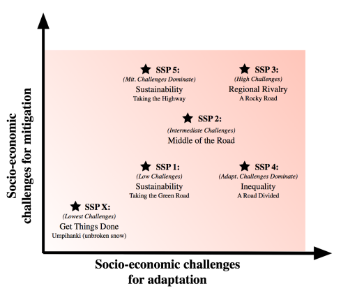
People building integrated assessment models (IAMs) for IPCC (among others) nowadays use set of narratives called “Shared socioeconomic pathways” (SSPs). These narratives are used to justify inputs, assumptions, and constraints of the models. There appears to be 5 set of narratives with a goal of “covering the uncertainty space of challenges to adaptation and mitigation.” or “spanning a relevant range of uncertainty in societal futures”. I do not think they succeed at this sufficiently well. These narratives influence the outcomes of the models, but are naturally mainly windows into modellers minds and I am at difficulty in seeing what their point even is. They do encourage pigeonholing discussions around the narratives, but why would that be a good thing? Well, be that as it may, a brief summary of the narratives the way I see them:

Shared socioeconomic pathways according to O’Neill et al.
- SSP 1: This is clearly where good moral people are supposed to migrate. Word salad of lovely buzzwords. Assumes efficiency and carbon intensities far outside historical norms and seems to have inexplicably internalized anti-nuclear bias as if this would have something to do with the stated goals of sustainability and inclusive development. Interestingly it is also a narrative of fairly high economic growth. Certainly not dramatically different from SSP 2.
- SSP 2: “Middle of the road”…well that is not inspiring, but at least there is some attempt to stick to historical norms on issues like carbon intensity and efficiency improvements. Narrative for middle aged men in gray suits.
- SSP 3: This is the dystopia. Only bad person would like this to happen. I will mostly skip this.
- SSP 4: Here you have some pro-nuclear assumptions, but strangely it is coupled to a scenario with increasing inequalities. How this happened is unclear.
- SSP 5: “Fossil-fueled development—Taking the highway”. This one in fact has plenty of socially progressive elements (just like SSP 1), but as a poison pill it is attached to fossil fuels by assumption. This has more globalization than SSP 1 and has an emphasis on competition. High economic growth so that GDP at 2100 can be substantially higher than in SPP 1.

How the carbon intensity and energy intensities develop in different narratives? SSP 2 and SSP 4 baselines seem to start from historical norms. SSP 1 way off.
SSP 1 seems to have many nice things I endorse, but sadly I am afraid it is riddled in internal conflicts. The stated aims are not clearly consistent with what is actually fed into the computers. Case in point – bioenergy. Relating to SSP 1 modellers state: “The choice to interpret the SSP1 storyline consistent with the “global sustainability” scenario family is consistent with the storyline described in O’Neill et al. (2017). For instance, the important role for bio-energy, renewables and CCS (in the climate policy case) perfectly fit in this interpretation of the SSP1 storyline…” What? Some of the modelling results can be explored in this database. So lets have a look.
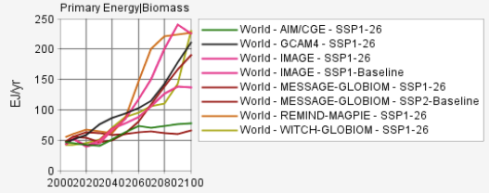
The 2.6 scenarios of the SSP 1 narrative typically see huge increases in biomass burning over the baseline. Very large fraction of this is supposed to happen with carbon capture which starts within next decade.
So SPP 1 narratives (and most others) typically end up with colossal role for bioenergy and so that very large fraction of that is equipped with carbon capture. Words: “sustainable path”, “respects environmental boundaries”, “lower resource intensity”. Actions: increase human appropriation of primary productivity massively without any serious consideration of social or ecological impacts. I spot a fairly serious problem here and this is a problem that has been around for a while (read my earlier observations on this here). Incentives for huge increases in bioenergy are created, but miraculously this would not affect food production or its yield development in any negative way and nor would it cause ecological damage worth mentioning. Gratefully criticism of this recklessness has been mounting and for a fresh summary I encourage you to read the column by Chelsey Harvey in the Scientific American.

Some typical bioenergy projections. Insanity across the narratives. All within planetary boundaries of course. #sarcasm

Implications of bioenergy expansion. Less natural habitats and more bioenergy plantations than farms for crops. Bioenergy volumes around 4x the crop volumes.
As I explored the narratives I noticed that I have been written out of existence. There is no narrative that represents me! An omission of this magnitude is clearly intolerable and I will try to start fixing it here. Below I provide a draft of my favoured narrative, but in case someone wishes to draft a better one, here is a link to a document and you are free to suggest improvements. Since SSP 1 assumes unjustified limitations on the acceptable toolboxes both technologically as well as socially, my narrative implies lower challenges to both mitigation and adaptation.
Fixed it! Umpihanki refers to a famous poem by Aaro Hellaakoski “Tietä käyden tien on vanki, vapaa on vain umpihanki.” Poor translation could be “Going by the road is to be imprisoned by the road, only free is the unbroken snow.”
SSP X – The missing pathway :

After a period of confusion world shifts towards prioritizing inclusive development and minimization of ecological damage. This transition is driven by increasing awareness of the endemic failure of climate policies as well as dissatisfaction in economic arrangements broadly considered as unfair and counter-productive. Educational and health investments accelerate the demographic transition, leading to a relatively low population. Driven by an increasing commitment to achieving development goals, inequality is reduced both across and within countries. At the same time, the improvements in human well-being, along with strong and flexible global, regional, and national institutions imply low challenges to adaptation. World places increasing faith in innovation and participatory societies to produce rapid technological progress and development of human capital as the path to sustainable development. There are also strong investments in health, education, and institutions to enhance human and social capital. International mobility is increased by gradually opening up labor markets as income disparities decrease.
Focus on results drives people towards pragmatic solutions and away from predetermined acceptable toolboxes and pathways. Grand narratives are seen as a sources of amusement and aids for imagination, but humanity is not constraint by them. All ecologically low impact tools for mitigation and adaptation are accepted, including non-biomass renewable energy, nuclear power, CCS, GMOs, and geoengineering as well as social changes influencing, for example, diets, car ownership, and urban planning. People realize the fundamental value of the broad set of options for themselves as well as for future generations.
How much is invested in which tool is a question approached pragmatically so that benefits are maximized relative to costs. World tries to learn as much as possible from the past experiences which implies planning based on historical trends for, for example, carbon and energy intensities and tools are evaluated according to their success in promoting deep decarbonization and human well-being.
Focus on effective decarbonization and adaptation lowers costs and reduces political obstacles for successful climate policies by reducing the political polarization around climate change. Pragmatism and humbleness towards our ability to predict and control the future, leads to policies providing broad support for R&D on mitigation and adaptation. Increased investments in broad technology portfolios lower the costs of technologies and guide future decisions on which solutions to scale rapidly. Uncertainty in projections makes people wary of allowing dreams of potential future technological solutions to constrain mitigation and adaptation portfolios today.
Increased environmental and social awareness implies desire to reduce biomass use and uncouple human activities from the biosphere. To support this, intensification of food production is strongly encouraged together with dietary changes towards plant based diets. Understanding the near term limitations of negative emissions, this narrative might be inconsistent with 2 degree goal. However, consistent with the narratives priorities, social and ecological goals take precedence over inflexible climate targets. Possible absence of 2 degrees (or 1.5 degrees) scenarios is not considered a failure, but a realistic acknowledgement of the situation.
Faster realization of failure, drives deeper understanding of the need for dramatic policy changes as well as for the long term need for adaptation and mitigation extending likely hundreds of years into the future. This values driven pragmatism implies faster mitigation and adaptation measures on the ground than in alternative narratives with impressive mitigation on spreadsheets. To promote longer term thinking, active policies are pursued to reduce scarcity mentality. This implies removing real scarcity among the most poor as well as reducing inequalities elsewhere. Confidence is built for adequate resources being available for worthy goals. Narrative is agnostic with respect to increased consumption or increased efficiency. If well-being is better promoted by increased consumption, then so be it. If goals are better achieved via efficiency, efficiency is pursued.
Many celebrated the Paris climate meeting as being a turning point and were extatic of the new “ambitious” 1.5 degrees warming target. This target will be quickly reached and then exceeded massively. I think it is a cynical move to avoid acknowledging the colossal failure of the policies during past decades. If we are to have a reasonable change to stay below 1.5 degrees, cumulative emissions should stay below approximately 1000G tons. We have already emitted about 600 and are adding more at a rate of about 40 Gt per year so the “ceiling” will be crossed in short order.

NGO:s have been especially excited on the new target and for example Greenpeace kindly suggests their own plan (+GWEC+SolarPower Europe lobby groups) as a way forward.
“We will push our beautifully simple solution to climate change – 100% renewable energy for all – and make sure it is heard and embraced. From schoolyards in Greece, to the streetlights of India, to small Arctic communities like Clyde River in Canada, we will showcase the clean, renewable solutions that are already here, and pressure our governments to make them available for everyone, fast.” Kumi Naidoo
However, since GP plan implies much greater warming than 1.5 degrees, it is unclear why this plan should be followed. Let me elaborate.
Energy [R]evolution scenario is in fact quite critical of bioenergy. While this doesn’t often translate to consistent behavior at the organizations grass root level at least some understanding does exist. Report says:
- “Any bioenergy project should replace energy produced from fossil fuels. considering the entire production chain, above- ground and below-ground carbon stock changes and any indirect land use changes (ILUC), the net greenhouse gas emission reduction of such a project must be at least 50% compared to a natural gas reference, 60% compared to an oil reference and 70% compared to a coal reference. This net emission reduction must be realized within 20 years.
- “Greenhouse gas emissions as a result of indirect land use change (ILUC) must be integrated in the greenhouse gas calculation methodology of crops (including trees) for bioenergy, grown on agricultural land, by determining crop- specific ILUC-factors.”
They continue…”Despite this, all bioenergy is accounted for as climate neutral leading to an enormous carbon accounting error. Therefore, carbon accounting schemes should stop assuming ‘carbon neutrality’ of bioenergy and account for the net direct and indirect greenhouse gas performance of bioenergy as outlined in the sustainability criteria for bioenergy presented in this document.” (As an aside for my Finnish readers I would like to point out that GP sustainability criteria effectively exclude pretty much all forrest bioenergy here. It remains to be seen how long it takes for this realization to diffuse into local Greenpeace and other NGO:s.)
This is great and I agree! But then… why is that on pages 317-318, where E[R] scenario numbers are given, climate impacts of bioenergy and biofuels are absent?

Emissions also from outside the energy sector.
The report is also very silent on the emissions outside energy sector. For example, large fraction of the GHG emissions are due to agriculture. If we add the GHG emissions that Greenpeace+friends do not count, this would probably add roughly 10Gt of CO2 emissions a year.
I conclude with a short movie summarizing what Greenpeace+GWEC+SolarPower Europe figures actually imply. The first two columns are based on CO2 emissions reported in E[R] scenario. Third one adds 10G tons of GHG emissions that the report seemed to brush aside. It has always been clear that Greenpeace scenarios are widely unrealistic (for large number of reasons), but as is clear, E[R] scenarios are also inconsistent with the 1.5 degree target they celebrate. In fact, given that large fraction of emissions are unaccounted for the scenarios are unlikely to be consistent even with the earlier 2 degrees target. Other scenario builders typically add massive amounts of CCS with bioenergy to get negative emissions later on the century. Greenpeace is opposed to CCS (well of course) so we can safely assume the cognitive dissonance will only get worse. Since the substance is lacking on NGO proposals, should we really be outraged if substance is also missing from the official policies? Is anybody actually serious about this?

Estimate of the cumulative emissions in Greenpeace E[R] scenarios. (3rd column adds 10Gt of yearly GHG emissions from missing bioenergy emissions, agriculture etc.) Last column indicates the level below which we have reasonable chance to stay below 1.5 degrees.

I found an article by Krausmann et al. on how human appropriation of primary production has evolved in the past 100 years or so. Human appropriation of net primary productivity (HANPP) has about doubled since early 1900 so that in 2005 humanity appropriated about 25% of all primary production on the continents. This has been one of the main causes of the ongoing wave of extinctions.

The article also showed some positive trends. Even though HANPP has doubled the population has actually grown by a factor of about 4. This means than HANPP per capita today is much lower than it was a century ago. This reduction has been possible thanks to improvements in land use efficiency (mainly due to modern agriculture). Today we produce much more food per unit of area than we used to. This positive development has nevertheless not been enough to reduce the total footprint of humanity.

Authors conclude with some possible extrapolations into the future. Earlier I wrote about my adventures among the IPCC mitigation scenarios (see also this). I focused on the way modellers dealt with nuclear power, but I was also tempted to highlight the crazy assumptions on bioenergy (with carbon capture) that many modellers made. Kraussmann et al. noted the same in their paper. Many mitigation scenarios casually imagine bioenergy use of around 300EJ/year (some assume much more. GCAM up to 862 EJ!). Figure 4 from the paper sketches what this implies for human impact on the biosphere. It would mean another doubling in HANPP and in a much shorter period of time.If you thought human have been causing serious environmental damage during the past century just wait what is going to happen in this one if we follow modellers fantasies!

Finally humanity came up with a climate policy that has real impact.
I have tried to find some serious discussions on the ecological impacts these models imply, but to no avail. Can somebody help me with this or is it really true that there is none? It seems that if primary productivity (tons of biomass or whatever) is assumed to be same before and after human meddling, modellers call meddling sustainable. There seems to be no discussion on biodiversity impacts, extinctions, erosion etc. etc. For that matter there seems to be very little discussion on impacts for food production either.
Maybe I am missing something, but ambitious IPCC mitigation scenarios assume a carbon price that rises to the level of 1000$/tCO2 (or much more) by the end of the century. If a hectare of land ties down let us say 5 tons of carbon per year, the revenue from CO2 capture schemes could be almost 20000$/year. If the same hectare produced 7 tons of wheat at about 250$/ton, revenue would be about 2000$/year… an order of magnitude less. Wouldn’t this create a very strong incentive for farmers to move from food production to BECCS (bioenergy with carbon capture and storage) game? Since the food is nevertheless needed, its price must start tracking the carbon price and increase massively during this century. I have a nasty feeling that modellers haven’t thought this through.

450ppm really is possible!
It is a cause for concern when modellers feel it safer and easier to build these kinds of scenarios rather than inform people that (thanks to colossal policy failures) 2 degree target is essentially unfeasible. It is about time modellers stop providing fig leaves for the policy makers.
“The beginning of all wisdom is acknowledgement of facts.”: Juho Kusti Paasikivi, the 7th president of Finland after Finland had lost a war against Soviet Union.
In its latest assessment report IPCC concluded that in order to get climate change under control world needs massive expansion of nuclear power, renewables, energy efficiency, and CCS. I am a numbers guy and therefore I was delighted when I found a useful database for many of the mitigation scenarios IPCC relied on in its latest report. There is a database for the scenarios and additional information and assumptions used on many scenarios can be found in another database. I found this very interesting since articles reporting on the scenarios often explain the underlying assumptions of the models poorly. I will focus now on how the modellers approached nuclear power. I didn’t have the patience to go through all scenarios and I focused on those with 450ppm CO2 target that contained all technologies optimally (allegedly). I found that quite a few modellers dealt with nuclear power in a way that left me wondering if their modelling is simply poorly disguised ideological propaganda.
Some main approaches used to influence how well nuclear power does in the models relative to variable renewables (wind and solar):
- In many models nuclear capacity increases massively. Hundreds and hundreds of reactors are constructed, but amazingly nobody learns anything! Capital costs for nuclear power are typically kept almost constant throughout the decarbonization pathways. On the other hand learning effects and technological evolution are assumed for other energy sources. For wind and solar power these are often assumed to be very dramatic and there are learning effects even for fossil fuels. So this tough love only seems to apply to nuclear power.
- Many models assume large cost reductions for wind and solar. In the end, this is not much more than a wishful guess.
- Some models assume anomalously large capacity factors for wind and solar. See for example, “Message Ampere2-450-FullTech-OPT” scenario. Capacity factors for wind are almost 40% while for solar power they use about 25-31% over the course of the century. Since real figures are more like half of the assumed figures, the model drastically underestimates the costs for wind and solar. (IMACLIM scenarios seem to do the same)
- Some models (IMACLIM in particular) assume very low capacity factor for nuclear. “IMACLIM Ampere2-450-FullTech-OPT” has a nuclear capacity factor of just 45% in 2100 while for wind and solar they have 36% and 38% respectively! This doesn’t just roughly double the cost of nuclear in these models, but also underestimates the costs for wind and solar.
- Some models (REMIND and MERGE-ETL) postulate a world running out of uranium together with no technology development for nuclear. This “peak uranium” then limits the role nuclear power plays in decarbonization.

Figure 1: Nuclear power in Remind Ampere2-450-FullTech-OPT scenario. Massive increase and then…
Let me discuss the sillyness of the last trick in more detail. Figure 1 shows what REMIND scenario got for nuclear power when all technologies were used “optimally”. So massive increase in nuclear power until middle of the century and then rapid decline. Decline is caused by uranium supplies running out as soon as light water reactors with once-through fuel cycle have used 23 million tons of uranium. This is very strange for several reasons.
First, this number doesn’t seem to bear any clear connection to known uranium resources which are about third of this figure. Modellers probably felt that using known resources as an upper limit would have been too stupid to pass the laugh test.
Second, mineral resources have a habit of increasing together with demand since increasing demand stimulates increasing investment in exploration and technology development. In the past one hundred years copper production has increased by an order of magnitude. All this time world has been “running out” of copper in about 40 years. Uranium is not especially rare element and there is no reason to believe we are running out of it anymore than we have for other metals such as tin which has about the same crustal abundance.
Third, from where does the assumption of no technology development come from? Wasn’t this supposed to be a scenario where all technologies are allowed? For nuclear power technologies that that improve the fuel efficiency by about two orders of magnitude are already known.
Fourth, why is there resource constraint only for nuclear power? The resource constraints are more severe for wind and solar power (and for bioenergy). In Figure 2 I show an image I picked up from a european study on critical metals for energy technologies. The elements with greatest supply risks are used in the construction of wind and solar power. (By the way, the only nuclear related element on the list is the low risk hafnium for control rods.) Figure 3 I picked up from a fairly recent Alonso et al. paper. Authors estimated that dysprosium (used in magnets) demand in renewables heavy mitigation scenarios is expected to be a whopping 2600% higher than projected supply already in 2035!

Figure 2: Critical metals for European “strategic energy technologies” according to European commission Joint research centre study.

Figure 3: Expected demand and supply for dysprosium according to Alonso et al. (2012).
What would happen if we were to apply modellers approach for renewables? Let us just take silver as an example. Silver reserves are estimated at about 530000 tons. Let us assume that “real” resource is 4 times this (remember uranium resource was set at 3 times the known reserves) and that half of this can be used for photovoltaics. There are after all other uses for silver as well. Since 1GW of solar power requires about 80 tons of silver, this means that at maximum we can have about 13TW of solar capacity as opposed to almost 90TW cumulative capacity REMIND modellers extrapolated. Instead of being the largest contributor to the primary energy supply its contribution would fall into 5-10% range. The amount of silver required to construct the solar power in REMIND FullTech scenario is about 13 times larger than the estimated global silver reserves. Now can there be ways around these constraints? Probably there are and maybe we could use less silver, but using substitutes might imply higher costs and worse performance and furthermore, if one was not permitted to use already demonstrated technologies for nuclear power why should imaginary advances be permitted for other alternatives?
What might we get if we remove this silly constraint from the model? Obviously I cannot repeat the exercise with the tools I have available, but we can get a rough estimate. Lets take the growth rate (4.8%) for nuclear power REMIND modellers established between 2020-2050 and just let it grow with the same rate until the end of the century. This is not extraordinary in the context of this model since for wind+solar the growth rate through the century was 7.6% even though capital costs are such the nuclear power seems to have a lower levelized cost of energy (5% discount) throughout the decarbonization pathway. I show the result in Figure 4. Nuclear power would end up dominating the energy supply.
I have a feeling that resource constraint was introduced specifically for this reason. Modellers first did their calculations without the constraint and ended up with a result that they found distasteful. They did not want to go on record with the scenario that might “rock the boat” or give people funny ideas. By introducing the resource limitation for nuclear power they could clip its wings and keep it supposedly as an option while limiting its role to the margin. In fact that strange 23 mton uranium resource limit seems to suggest that over the century LWR:s cannot produce more than maybe around 5% of the primary energy. I suspect that modellers worked backwards and set the resource limitation based on the maximum share of the energy supply they were ready to grant for nuclear power. Not cool.

Figure 4: There, I fixed it!
Then there is PRIMES…sigh. This is a model I encountered few years ago as I was reading EU:s 2050 energy strategy. I remember glancing at the referee report and being troubled by the brief remark on page 6. Referee had asked about rather optimistic cost assumptions to which response was that if capital costs for wind are set higher then the future learning curve can be steeper. To me this suggested that modellers were perhaps fitting model to the fantasy. In the AMPERE database PRIMES scenarios for EU are also included. I was naturally most interested in the Ampere5-Decarb-AllOptions scenario which according to authors is a scenario “with all technological decarbonisation options available and used according to cost optimality; this scenario provides the least cost decarbonisation pathway for the EU.” Sounds interesting! However, as you look at the actual results you notice something weird. The capital costs assumed are such that nuclear (again) has the lowest LCOE throughout the decarbonization pathway. Despite this modellers claim that nuclear generation in EU will decline by 20% by 2050. How is this even possible?

Then I noticed a strange footnote on page 15: “PRIMES assumes that nuclear development has been significantly affected in the aftermath of the nuclear accident in Fukushima in March 2011. Both PRIMES and TIMES-PanEu impose national constraints regarding nuclear, such as countries’ decisions not to use nuclear power at all…” Please tell me that I am reading this wrong. They didn’t just exclude nuclear power from large parts of EU in their “all options” scenario for political reasons and then sell it as the cost optimal one?
I have now outlined several ways in which scenario modellers seem to suppress nuclear power from their reference scenarios where all options and technologies are supposedly on the table. This has also consequences for the other scenarios and comparisons between them. Since modellers suppressed nuclear power already in “the tech neutral” scenarios adding additional anti-nuclear policy, can be presented as not really having major cost consequences.

Figure 2: The empty box on the left has nuclear power in it and the box on the right had it removed. Amazingly it looks almost the same as the other empty box!
Since I am a bad boy I will conclude with some rough estimates on what would it take to replace (gasp!) solar and wind power at the end of the model scenarios with nuclear power that generates the same amount of electricity. I simply estimate the required nuclear capacity (90% CF) and use modellers assumptions about capital costs. Required yearly outlay is roughly total capital required divided by the lifetime of the plant. I will use 30 year lifetime for wind and solar and 60 years for nuclear. (Numbers are in billions of 2005$…I think.)
| Model | Wind+solar capital | Nuclear capital | (Wind+solar)/year | Nuclear/year |
| Remind 450-FullTech-OPT | 74540 | 62753 | 2485 | 1046 |
| Message 450-FullTech-OPT | 40620 | 64150 | 1354 | 1070 |
| IMACLIM 450-FullTech-OPT | 5680 | 5765 | 189 | 96 |
| Primes Decarb-AllOptions (EU) | 1430 | 826 | 48 | 14 |
| Primes HIEFF-NoCCS-NoNUKE (EU) | 1555 | 900 | 52 | 15 |
In all models the required yearly outlay (at 2100 or 2050 for PRIMES) for energy supply is dramatically lower if we replace wind and solar capacity with nuclear power. This despite the fact that MESSAGE and IMACLIM assumed unrealistically high capacity factors for variable renewables. It is remarkable than even though this kind of chicanery was going on behind many models, IPCC still ended up concluding that nuclear power must expand massively. This is perhaps partly because not all scenario builders were intellectually dishonest about this issue and some models ended up, for example, with ten fold increases in nuclear capacity. On the other hand I am afraid that all 450ppm scenarios are utterly unrealistic….and don’t get me started on their absurd bioenergy projections.
P.S. I spent some time copying the data I was interested in from the database. Interface seems a bit uncomfortable for that. Here is a link to some of the data I extracted.
P.P.S. For laughs you might want to check IMACLIM model with 550 ppm goal and CCS excluded. Since the original one was very strongly dependent on CCS one would imagine that ruling it out would have interesting consequences for the energy mix. See what modelers assumed for the capital costs of nuclear here to suppress that out of control (critical?) nuclear growth early in the century.
LOL
Note added 6.10.2019: It would seem that the capital cost data for the AR5 scenarios has been removed from the database. At least I cannot find it anymore. Can someone explain where is it now?
 Sopivasti vaalien alla ilmestyi uusi kuvia kumartamaton kontribuutio ilmasto- ja energiakeskusteluun. Janne Korhosen ja Rauli Partasen kirja “Uhkapeli ilmastolla” kannattaa ehdottomasti hankkia. Kirja keskittyy moniin teemoihin, joita itsekin olen nostanut esiin. Kirja ei myöskään ole paksu vaan on selvästi tarkoitettu nopeasti luettavaksi ajatusten herättäjäksi ja (kuten kirjoittajat itsekin kertovat) keskustelun avaajaksi. He perustavat väitteensä asiallisiin tutkimuksiin ja lähteisiin, joita esimerkiksi ympäristöjärjestöt itse tuntuvat pitävän luotettavina ainakin silloin, kun viesti sopii ennakkoasenteisiin. (Itse asiassa osa lähteistä on järjestöjen itse tilaamia tai kirjoittamia raportteja.)
Kirja paneutuu ympäristöjärjestöjen huolestuttavaan sinisilmäisyyteen uusiutuvan energian mahdollisuuksista ja etenkin väitteisiin, että mitään muuta kuin uusiutuvia ei tarvita. Kirjassa esitetään esimerkiksi oheinen IPCC:n SSREN raportiin perustuva kuva 164 skenaariosta ja siitä minkälainen rooli uusiutuvilla voisi olla vuonna 2050. AINUTKAAN skenaario ei kyennyt tyydyttämään edes nykyistä energiankulutusta pelkästään uusiutuvilla ja tämä raportissa, jonka tekijät omasivat positiivisen ennakkoasenteen alaa kohtaan.

Keskusteltuaan tämän uskomuksen vaarallisuudesta suhteessa ilmaston muutoksen torjuntaan kirjoittajat jatkavat käsittelemään laajalle levinnyttä vääristelyä ydinvoimasta ja säteilysuojelusta. Tiiviissä ja hyvin luettavassa paketissa he debunkkaavat yleisimmin esitetyt uskomukset sekä teemaan liittyvästä tieteestä kuin myös keskustelusta eri energialähteiden taloudellisuudesta.
Tekijät varoittavat harjoitetun epärehellisyyden vaarantavan ei ainoastaan työn ilmastonmuutoksen torjumiseksi vaan myös nakertavan pohjan uusiutuvan energian lisäämiseltä. (Amen to that!) He ilmoittavat myös olevansa valmiita korjaamaan väitteitään mikäli kuulevat parempia perusteluja. Eli jos olet kirjan luettuasi heidän kanssaan eri mieltä, ryhdy pohtimaan järkevämpiä argumentteja kuin ne mitkä tässä kirjassa ammutaan alas.
Ensi keskiviikkona 11.3 järjestetään muuten Bio Rexissä Helsingissä energiakeskustelu. Jos olet onnekas, saatat saada kirjan paikan päältä.
Greenpeace jakaa oheista nerokasta grafiikkaa, jossa jo totuttuun tapaan jätetään kertomatta kuinka heidän suosimansa vaihtoehdot oikeasti suhtautuvat heidän kauhistelemaansa projektinhallinnaltaan sössittyyn Olkiluodon reaktoriin.
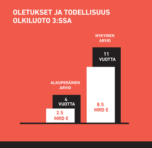
Todellisuus Greenpeacen lokerossa
Lisätään nyt tuohonkin kuvaan se mitä he eivät halua kertoa. Lisään Greenpeacen palkkien viereen palkit kuvaamaan sitä mitä vastaavan vuosittaisen sähkömäärän tuottaminen vaatii muilla tavoilla. Ensin tuulivoiman palkki. Pääomakustannukset otan tuoreesta IPCC WG3 raportista (tässä linkki relevanttiin sivuun), kun taas rakennusajan arvion Tanskan luvuista. (IPCC:n pääomakustannukset eivät sisällä rakennusajan korkoja joten siinä mielessä ne arvioivat kustannukset alhaisemmaksi kuin tuo Greenpeace:n luku OL3:lle. Olettaen siis, että korot ovat tuossa 8.5 miljardin arviossa mukana.) Suomi ja Tanska ovat suunnilleen saman kokoisia maita ja otan Tanskan luvut sellaisenaan. Arvioin Tanskan rakennustahdiksi n. 0.19 GW tuulivoimakapasiteettia vuodessa ja oletan tuulivoiman kapasiteettikertoimeksi 25%. (Huom. En ota tässä huomioon laitosten erilaista elinikää. OL3:n suunniteltu elinikä on kolminkertainen tuulivoimaloihin nähden eli se tuottaa merkittävästi enemmän sähköä kuin vastaavan keskitehon omaavat tuulivoimalat. Samoin tuulivoiman satunnaisuus yms. lakaistaan nyt maton alle.)

Outside the box: kustannus perustuu IPCC WG3 mediaaniin maatuulivoimalle ja rakennustahti Tanskan saavutuksiin.
Sitten sama aurinkosähkölle. Otan taas pääomakustannukset IPCC:ltä, mutta käytän “utility” luokan laitosten pääomakustannuksia. Tämä siksi, että en vahingossa kohtelisi aurinkosähköä epäreilusti. Toisten rakastamat katoille sijoitettavat paneelit nimittäin maksaisivat noin 40% enemmän. Rakennustahdin otan Saksasta, jossa rakennettiin noin 35 GW aurinkosähkökapasiteettia 10 vuoden aikana. Jotta luku saadaan vertailukelpoiseksi skaalaan sen väkiluvun suhteessa eli tekijällä 14.7. Oletan aurinkosähkön kapasiteettikertoimeksi 10% mikä on lienee hiukan optimistista Suomessa.

Outside the box: kustannukset perustuvat IPCC WG3 mediaani lukuun “utility scale” laitoksille. Rakennustahti Saksasta korjattuna väkiluvulla
Valitettavasti lukuja on hiukan hankalaa edes esittää samassa kuvassa, mutta pidän itseäni siihen syyttömänä. Tässä on muuten vielä se hauska puoli, että en yllä ottanut laitosten elinikää lainkaan huomioon ja tämä on itse asiassa merkittävä virhe. Aurinkopaneelien elinikä on ehkä 25 vuotta ja tämä tarkoittaa, että rakennustahti 0.24 GW/vuosi (Saksan luku skaalattuna väkiluvulla) ei voi tuottaa enempää kuin noin 6 GW aurinkosähkökapasiteettia. Toisin sanoen rakennustahti ei riitä OL3:n tuotantoon pääsemiseksi koskaan ja palkissa mainittu 60 vuotta muuttuukin merkityksettömäksi.
Jotta Greenpeacen älyllinen haaksirikko huipentuisi, ei ole syytä unohtaa, että kauhisteltuaan OL3:n hintaa he vaativat takuuhintaa aurinkosähkölle sen kannustamiseksi. Syystä tai toisesta he jättävät kuitenkin (taas) mainitsematta kuinka korkean tämän takuuhinnan tulisi olla, jotta kannustin “toimii”. Miksiköhän?
In previous posts I discussed the size of the challenge and messed up cost comparisons WGIII provides. Here I provide few observations on how WGIII deals with bioenergy. The 2007 assessment report as well as the 2011 renewables report were largely uncritical of bioenergy/biofuels, but now some warnings have been added to 5th assessment report. But still… These warnings are largely to be found only in the actual report while the summary for policy makers creates, in my opinion, more positive image.

Realizing that BECCS is the key?
“Bioenergy can play a critical role for mitigation, but there are issues to consider, such as the sustainability of practices and the efficiency of bioenergy systems (robust evidence, medium agreement) [11.4.4, Box 11.5, 11.13.6, 11.13.7]. Barriers to large‐scale deployment of bioenergy include concerns about GHG emissions from land, food security, water resources, biodiversity conservation and livelihoods. The scientific debate about the overall climate impact related to landuse competition effects of specific bioenergy pathways remains unresolved (robust evidence, high agreement)” WGIII Summary for policy makers
Notice how this is phrased. It starts by saying bioenergy can play a critical role (robust evidence, medium agreement) and then ends by saying that we do not actually know what climate impacts are (robust evidence, high agreement). In my opinion, caution should be emphasized here since were are dealing with issues with very large ecological and social consequences. Summary for policy makers also seems to discuss, in practice non-existent, bioenergy with carbon capture and storage (BECCS) as some independent technology while in the real report it is quite clearly mentioned in the context of geoengineering (quite rightly of course).
Here and there the report seems very confused about bioenergy and especially serious ecological or social damage assessment is largely missing. For example, in chapter 6 (table 6.7) only water use is mentioned as an adverse effect of bioenergy! Sometimes existence some risks are mentioned, but not in such a way as to identify what action in particular is risky and how it relates to current bioenergy practices. This gives me a feeling of CMA (cover my ass) type of activity. Without actually saying clearly what types of bioenergy schemes are counterproductive, what use is this? WGIII doesn’t say that US corn ethanol scheme would be stupid, or that maybe German biodiesel production is not the brightest of ideas, or that perhaps forestry practices in Scandinavia might leave something to be desired from climate and biodiversity perspective.
Or what do you think about this?
“Bioenergy can be deployed as solid, liquid and gaseous fuels to provide transport, electricity, and heat for a wide range of uses, including cooking, and depending on how and where implemented, can lead to either beneficial or undesirable consequences for climate change mitigation (robust evidence, high agreement)…Scientific debate about the marginal emissions of most bioenergy pathways, in particular around land‐mediated equilibrium effects (such as indirect landuse change), remains unresolved (robust evidence, high agreement)” WGIII Chapter 11
So basically they say that either bioenergy is a good idea or a bad idea and are happy to announce robust agreement on this. Then later on page 27 of Chapter 11 they say ” This assessment agrees on a technical bioenergy potential of around 100 EJ, and possibly 300 EJ and higher.” What am I supposed to learn from this? If IPCC is seriously proposing 300EJ they are irresponsibly deluded. In fact, the Figure 11.20 seems to suggest that there is high agreement only about the roughly 100EJ amount (technical potential). So why are those higher numbers so casually thrown around elsewhere in the report?
Between the lines you might perhaps be able to read something. WGIII mentions several times how bioenergy schemes on degraded lands could have multiple positive impacts, but what fraction of current bioenergy schemes fall into this category? If I guess that approximately 0%, am I wrong? WGIII doesn’t tell. Reading the report I get a feeling that unsustainable bioenergy practices would only be some speculative risks in the future rather than standard operating practice of most bioenergy schemes today. Since no bad practices are identified, everyone can declare unsustainable practices are things done by others. The effect can be de facto promotion of those unsustainable practices today by creating a narrative for sustainable practices in the future. Furthermore, the bioenergy scenarios WGIII presents as mitigation tools seem to be on such a massive scale that I do not believe degraded lands, waste streams etc. can ever provide more than than a very small fraction of the required biomass. See for example Fig 6.20 (below) from Chapter 6.

IPCC WGIII Chapter 6 Fig. 6.20
In scenarios roughly consistent with 2℃ goal (blue dots) we are supposed to get around 300 EJ of primary energy from bioenergy and most of it equipped with carbon capture and storage (BECCS). What does this mean? Well first of all, it might mean no climate benefits, since WGIII had an agreement that this is not understood. Only ecological and social damage seems guaranteed. Second, the primary productivity of terrestrial biosphere is apparently around 56.4 Gt C/yr which means that 300EJ would amount to around 20% of all primary productivity of the continents. This is not just geoengineering. It is geoengineering on steroids. Given that one of the main drivers of extinctions is the ever increasing share of primary productivity appropriated by Homo Sapiens the idea that this extra diversion might even have some biodiversity benefits (speculated about in Chapter 6) is preposterous. In chapter 6 WGIII also gives results with different amounts of negative emissions — either more than 20Gt CO2/year or less. That 20Gt is roughly consistent with the ridiculously large bioenergy production equipped with CCS. Having presented such idiocy as a possible solution WGIII says later in Chapter 11:
“Full GHG impacts, including those from feedbacks (e.g., iLUC) or leakage, are often difficult to determine (Searchinger et al., 2008). Feedbacks between GHG reduction and other important objectives such as provision of livelihoods and sufficient food or the maintenance of ecosystem services and biodiversity are not completely understood.”
Again, where is the precautionary principle when you actually need it? But let us get crazy and start thinking where we could produce that 300EJ. It amount to perhaps 10 Gt/year of carbon from the biosphere. Given that in most places where people live, they already appropriate outrageously large amount of primary productivity (see figure), we should head somewhere where our footprint isn’t quite so large.

If I have a look at the world map with primary productivity shown as well (see figure), it seems that most obvious choices are either northern wastelands, Amazon, or central Africa. Since things don’t grow that well in Siberia and there is hardly anyone there to do the work, we would be left with the unenviable task of terraforming rainforests into energy plantations. How much area would we need? With around 1kg C/m2 combined area of the Amazon rainforest and Congolian rainforest would not be quite enough. With synthetic fertilizers, irrigation etc. we could boost this, but how much energy does it take and where does the water come from? If you want to use degraded land, we will need more space since that land is presumably called degraded for a reason.

Where to grow all that biomass?
Many bioenergy schemes have a low energy return on energy invested (EROEI). In other words we spend a lot of energy in producing bioenergy compared to the amount of useful energy when the fuel is consumed. I was not entirely surprised to notice that the term EROEI did not seem to appear in the report. It is usually brushed aside since dealing seriously with it might rock the boat.
When it comes to bioenergy it must be kept in mind that large financial interests are at stake. Fossil fuel producers have not been too happy with climate science and we can rest assured that countries relying heavily on bioenergy and related schemes will not be happy if impacts of bioenergy are seriously evaluated. When WGIII report was released a high official from Finnish Ministry of employment and the economy declared that Finland can only reach 80-95% emissions reduction goal if bioenergy is counted as climate neutral. Notice that it is not a question if it really IS climate neutral, just that on paper it must be counted as such. I am certain that similar political pressures exist in many other countries on this issue. Also among environists (“enviromentalist without the mental part” Tom Blees) there has been a proliferation of renewables only energy “plans”. Most of them rely heavily on bioenergy and on assuming its beneficial climate impacts. These groups are unlikely to acknowledge easily that they got it wrong. If they do so they might have to rethink the role of nuclear power. However, opposing nuclear power is an identity issue for many environist and they will find it easier to live in denial about environmental and social impacts of bioenergy.
Update 17.5.2015: Some quotations above didn’t make it to the final report. When writing this post I was reading the Final Draft. I thank Glen Peters (@Peters_Glen) for pointing this out.
 In an earlier post I briefly discussed the scale of the challenge. In this one I discuss briefly how the report discusses ethical issues surrounding responsibilities towards future generations, with a special focus on discounting and how it relates to cost estimates of various energy options.
“The use of a temporal discount rate has a crucial impact on the evaluation of mitigation policies and measures. The social discount rate is the minimum rate of expected social return that compensates for the increased intergenerational inequalities and the potential increased collective risk that an action generates. Even with disagreement on the level of the discount rate, a consensus favours using declining risk‐free discount rates over longer time horizons (high confidence).
An appropriate social risk‐free discount rate for consumption is between one and three times the anticipated growth rate in real per capita consumption (medium confidence). This judgement is based on an application of the Ramsey rule using typical values in the literature of normative parameters in the rule. Ultimately, however, these are normative choices.” IPCC WGIII Chapter 3
“A simple arbitrage argument favours using the interest rate as the discount rate for climate policy decisions: if one reallocates capital from a safe but marginal project (whose return must be equal to the interest rate) to a safe project with the same maturity whose return is smaller than the interest rate, the net impact is null for the current generation, and is negative for future generations. Thus, when projects are financed by a reallocation of capital rather than an increase in aggregate saving (reducing consumption), the discount rate should be equal to the shadow cost of capital.
…
This descriptive approach to the discount rate has many drawbacks. First, we should not expect markets to aggregate preferences efficiently when some agents are not able to trade, as is the case for future generations (Diamond, 1977). Second, current interest rates are driven by the potentially impatient attitude of current consumers towards transferring their own consumption to the future. But climate change is about transferring consumption across different people and generations, so that determining the appropriate social discount rate is mostly a normative problem. Thirdly, we do not observe safe assets with maturities similar to those of climate impacts, so the arbitrage argument cannot be applied.” IPCC WGIII Chapter 3
This discussion on discount rates is in my opinion very important since discount rates capture lots of the ethical underpinnings of our responsibilities to future generations. Discount rates tell about our time horizons and about how patient we are in waiting for gains. If you are offered money right now and twice as much at a later date, how long are you willing to wait? If the discount rate is 10%, you might be ready to wait for about 7 years and if it is 5% you wait for 14 years. Stern review used a rate of 1.4% for climate change damages in which case you are ready to wait for 50 years. In this case the time horizon is truly inter-generational. As explained by the WGIII, how to discount is in the end of the day a normative choice. However, it is a choice whose impact should be openly discussed and a choice that should be reasonably defended. In general I found the Chapter 3 “Social, Economic and Ethical Concepts and Methods” interesting and I have to read it more carefully later. I recommend that authors of WGIII Chapter 7 “Energy Systems” also read it.
WGIII gives the levelized cost of energy for different energy sources in Figure 7.7 of Chapter 7. If you look at figure 7.7 (below) carefully you will perhaps notice something funny. In the 4th assessment report at 2007 the costs were given as shown in Figure 4.27 (see copy here). It is not the most beautiful of figures, but clear enough.

Figure 7.7 from IPCC WGIII Chapter 7 (2014)

Fig 4.27 from WGIII 2007
It shows the results at two different discount rates with coal, gas, and nuclear as the lowest cost options. Somebody was clearly not happy with this and wanted to change the figure into Fig. 7.7 of the new report. As I glanced at the figure first I naturally choose to compare “red” bars with red bars and blue ones with blue. After all we shouldn’t compare apples and oranges. Maybe you did the same? However, I then noticed that red color assumed “high full load hours”. What does that actually mean? In order to figure out, one has to read the annex III for detailed assumptions (how many are going to do that?). For nuclear power “high full load hours” meant a capacity factor of 84 %, for onshore wind 40%, and 27% for solar PV. For nuclear power this a typical capacity factor (although many reactors do better), but for wind and solar power those capacity factors are very atypical. So the figure is constructed in such away that uninformed reader is likely to make incorrect comparisons. In fact, WGIII concludes the caption of Fig. 7.7 (its on the next page and likely to be missed) by saying “Note: The inter-comparability of LCOE is limited. For details on general methodological issues and interpretation see Annexes as mentioned above. ” Indeed. Given that comparisons cannot really be made, why was this approach chosen in the first place? If you can come up with a charitable explanation I am all ears, but to me this seems like authors of Chapter 7 were actively working to make comparisons hard.
How did the authors of Chapter 7 approach the discounting? Let us guess that economic growth in the future is around 2%. In this case the Ramsey rule mentioned by the IPCC in Chapter 3 suggests a discount rate in the range of 2-6%. What discount rate is used in chapter 7 to compare levelized cost of energy (LCOE) for different energy sources? That would be 10%! Authors of WGIII decided not only to use very high discount rate, but also not to give their results at different discount rates so that the effects of this assumption could be observed. Considering that authors of Chapter 3 specifically emphasized how crucial this issue is in evaluating mitigation policies, the approach in Chapter 7 seems indefensible. At minimum one would expect them to show results over broad range of discount rates, but this they decided not to do. Since they refused to do it, I will quickly do it here and see what difference it makes. (Note that some results with 5% discount rate are hidden in annex III, but these are only for the high FLH case so no honest comparison is possible.) In order to make sure that I know what I am doing I try to reproduce typical LCOE figures for WGIII high FLH case. I copy typical numbers from the annex III and this is what I get.
LCOE $(2010)/MWh comparison based on WGIII high FLH case (warning: misleading comparison!):
| Technology | LCOE 10% high FLH (IPCC median) | My result |
| Nuclear | 99 | 97 |
| Coal PC | 78 | 78 |
| Wind onshore | 84 | 85 |
| Solar PV (rooftop) | 220 | 220 |
| CCS-coal-PC | 130 | 123 |
OK, the numbers are not exactly the same, but close enough for me. I am not sure how WGIII defined the median here. Also, maybe there is some index inconsistency somewhere in the summations…who knows. Basic point is that I can reproduce the WGIII values reasonably well and I am on the same map as WGIII. We are ready to go! So let me then look at the things WGIII decided not to show. I will now compute typical LCOE for few technologies at 10%, 5% and 1.4% discount rates. It turns out that as discount rate is lowered the LCOE for nuclear power drops from 97$/MWh to 62$/MWh, and finally to 42$/MWh. I will summarize the rest of the results by giving the costs relative to nuclear power. The values colored green are higher than the LCOE of nuclear while red is lower.
Difference to the cost of nuclear (go right if you prefer responsible long term thinking):
| Technology | 10% discount rate | 5% discount rate | 1.4% discount rate |
| Nuclear | 0% | 0% | 0% |
| Coal PC | -18% | +5% | +34% |
| Wind onshore | +40% | +57% | +77% |
| Solar PV (rooftop) | +190% | +210% | +230% |
| CCS-coal-PC | +27% | +63% | +110% |
(Main assumptions: Most numbers are copied from annex III of WGIII and I just list the differences here.I choose the capacity factor for wind power as 25% which is higher than European or Chinese average, but somewhat less than US average. Most of the wind power capacity in the world does worse than this. I choose the wind turbine lifetime as 20 years as opposed to WGIII value of 25 years, since 20 year lifetime is given by wind turbine manufacturers. This doesn’t change anything of relevance though. I choose PV capacity factor as 15%. In good locations capacity factor can be higher than this, but for example in Germany it is around 10%. Therefore 15% seems fair. I assumed PV capital costs as 3000 $/kW which is substantially less than the WGIII median value of 4400 $/kW. You can check the calculations and assumptions from these Matlab files LCOE_IPCC.m, IPCC_Compare.m, and CompareForReal.m. In combination with annex III files should be quite self-explanatory and not too difficult to translate to other number crunching tools.)
As you can see green dominates and with the possible exception of hydro power in good locations, nuclear power is the lowest cost zero carbon source of electricity no matter what discount rate was used. At 10% discount rate it has difficulty at competing with coal, but at 5% it becomes cheaper than coal. As discount rate is lowered the cost advantage of nuclear relative to other low carbon energy sources is rapidly increased. With 1.4% discount rate and a time horizon extending across generations nuclear power is cheaper than other options by a very large margin. These results are based on the WGIII numbers and the only changes are those listed above to mainly account for differences in capacity factors. We could make the above table all green by adding a carbon price of only around 20 $/tCO2.
Maybe this discussion on the role of discount rates is simply too radical and WGIII is just following conventions? Well, not really. It is certainly not too radical for WGIII since in its 2011 SSREN report focusing on renewables WGIII gave precisely this type of comparison with 10%, 7%, and 3% discount rates (Fig 10.29 p. 844 in Chapter 10). Some of its authors were even authors of this report. Of course from SSREN report nuclear power was purged at the outset and results which might give readers funny ideas did not have to be shown. Absurdly the discussion on discount rates in this context is far more extensive in SSREN while in this report it has been brushed aside contrary to the emphasis by the authors of Chapter 3 of WGIII. We can only speculate as to why.
To me it seems that on this issue the authors of Chapter 7 were working hard to make sure that uninformed would remain uninformed while giving a chance to say to informed ones: “We are not lying! We are open about the methodology…see annex III etc. Yeah, maybe figure 7.7 is not as clear as it could be. Thanks for the tip! Clear communication is super important and we will keep it in mind for the next assessment report! Blaah blaah blaah…” IPCC should be an expert body giving accurate evidence based material for policy discussions. Sadly in this case WGIII decided not to give this material and compromised its supposed “policy-neutrality”. In plain english, authors of Chapter 7 decided not to do their jobs since doing it would have provided facts suggesting that some mitigation policies are likely to be more effective than others. But this is what they should do! If people decide to brush the cost differences aside, that is their choice, but it is not the role of an expert to fudge figures in such a way that implications of different policy choices are hidden.

Authors of Chapter 7 did what?
While the WGIII messed up the presentation of the costs that we are in a position to know fairly well, it spends a lot of time in speculating about long term costs using integrated assessment models. Since we are not able to predict the future of mankind, I do not think that these games are much more than computer generated guesses based on the preferences of whoever is doing the modeling. I think we are better of in focusing on issues that we can actually control at least to some degree. The Economists was also not very impressed about this:
“The IPCC still thinks it might be possible to hit the emissions target by tripling, to 80%, the share of low-carbon energy sources, such as solar, wind and nuclear power, used in electricity generation. It reckons this would require investment in such energy to go up by $147 billion a year until 2030 (and for investment in conventional carbon-producing power generation to be cut by $30 billion a year). In total, the panel says, the world could keep carbon concentrations to the requisite level by actions that would reduce annual economic growth by a mere 0.06 percentage points in 2100.
These numbers look preposterous. Germany and Spain have gone further than most in using public subsidies to boost the share of renewable energy (though to nothing like 80%) and their bills have been enormous: 0.6% of GDP a year in Germany and 0.8% in Spain. The costs of emission-reduction measures have routinely proved much higher than expected.
Moreover, the assumptions used to calculate long-term costs in the models are, as Robert Pindyck of the National Bureau of Economic Research, in Cambridge, Massachusetts, put it, “completely made up”. In such circumstances, estimates of the costs and benefits of climate change in 2100 are next to useless. Of the IPCC’s three recent reports, the first two (on the natural science and on adapting to global warming) were valuable. This one isn’t.” The Economist. While I think the report has some interesting things as well, when it comes to cost estimates I tend to agree with The Economists.
Finally, in my opinion the fact that companies use the short time horizons implied by 10% (or higher) discount rates is a clear indication of a market failure. Climate change requires longer term decisions and if such decisions cannot be delivered by current markets, those markets need to change. Either the state with a longer time horizon must become more active or appropriate sticks and carrots should be developed to discourage short term profit taking and promote longer term visions.

IPCC WGIII report on mitigation is out and since it is long I suspect that it will make sense to split my commentary in small pieces. Everybody cherry picks from these reports and I will be no different. I will cherry pick from the parts that I feel are most relevant, interesting (for me), or most target rich. The report is kind of long and I have made no attempt to read every single line of it. So lets get going..
Magnitude of the challenge
To grasp the main point see the Fig. 6.18 from the report. The figure shows a large collection of fantasies of what might happen and how the story relates to concentrations of greenhouse gases and thus to global warming. Scenarios with estimated CO2 concentrations in the range between 430-480 ppm are the blue dots and the rest imply stronger heating than the political goal of roughly 2 ℃. Note, however, that in most scenarios concentrations actually overshoot 450 ppm and rely on negative emissions technologies to ride to the rescue in the later part of the century. (I wonder if anyone making decisions at 2050 reads are cares about reports written in 2014? I certainly wont.) On the x-axis we have the global final energy use and on the y-axis we have low-carbon (nuclear, renewables, CCS) primary energy supply.

Modified from IPCC WGIII 2014 Chapter 6 p.40 Fig. 6.18
The first thing to note is that bulk of those pretty blue dots correspond to final energy use of about 500EJ which is about 40% higher than today. Therefore, the blue dots implicitly assume a growth rate of around 0.8%. This is much lower than our recent past would suggest and if we were to use perhaps more realistic growth rate of 2%, the final energy use would grow 120% from 2010-2050 so that the final energy use would rise to almost 790 EJ, a value that is almost off-scale in the figure. This suggests that not only do most of those blue dots rely on non-existing negative emission technologies, but they also rely on very radical assumptions about consumption growth.
To illustrate the 2nd point, I added to the figure few line to make trends clearer. The green line shows estimated trend for the addition of low carbon energy 1970-2000, the red line shows the progress 2000-2010, and the blue line shows what is needed to get to those blue points. Ironically enough as public expressions of climate concerns have escalated, the actual effort to decarbonize has been reduced (see also here). Even with the low estimates of consumption growth, the current low carbon additions to energy supply are too low by more than a factor of ten.
Let me illustrate the gap between talk and substance by a simple numerical example. Wind resource is huge and can (so we are told) power the entire planet many times over. So let us just build wind turbines to cover most of that low carbon energy needs. Let us say 400EJ of wind energy by 2050 and ignore all integration, cost, and land use issues. (Since at this level wind electricity would also be transformed to other forms of energy such as heat, I will ignore the distinction between primary energy and electricity here. 1kWh of electricity is no more than 1kWh of heat. If you object you can divide the relevant numbers by about 3, but it will not change anything of relevance.) If the turbines have a 20 year lifetime and they run at 25% capacity factors we will need about 51TW of wind power capacity at 2050. Taking into account that 20 year lifetime maintaining this level requires a construction rate of around 51000GW/20 year=2500GW/year. Last year 27 GW of wind power capacity was installed in the world. The amount needed is therefore off by about a factor of 100. (If you add that factor of three…”just” a factor of 30 or so.)
I find it troubling that in addition to supposedly avoiding telling countries what policies to pursue, IPCC also declines from comparing past policies with respect to their success at mitigating emissions. This is largely an empirical question with obvious relevance for mitigation and responsible governments should welcome critical evaluation of their policies by outside experts. However, I guess the keyword here is “responsible” and suspect that honest comparison cannot be made since it would be politically too inconvenient for many countries. The fact remains that to date countries most successful in reducing their GHG emissions, were countries like Sweden and France in the 80’s without any climate policies whatsoever (see here, here, and here for a Global Carbon Project presentation on page 12, for example). The politics in the past few decades has been heavy on rhetoric and ever lighter on substance. In conclusion I find it very unlikely that we will stay below 2 ℃ warming. The goal is too demanding and is not made any easier by the woefully inadequate response demonstrated by every single country on the planet.

